|
Parkland
College > Fine & Applied
Arts > Graphic
Design | Web Design
>
GDS 214 WEB DESIGN II Flash MX Text Effect (The Ripple Effect) Instructor: Rob Higgins |
| |
|
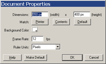
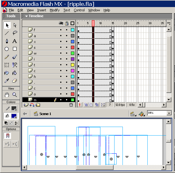
The ripple effect is an impressive way to emphasize a single word or phrase. Often it is used in a sequence or part of an intro or splash presentation. Although I am sure that many professionals have used this type of technique, I first learned how to do it in Flash 4 from the book “Flash Web Design – the art of motion graphics” by Hillman Curtis. I remember seeing it again from Luke Turner –theVOID in “Masters of Flash” by Friends of Ed. Sham Bhangal from Friends of Ed has now published a version using Flash MX’s actionscript instead of tweening. I currently use this technique and a couple others that are similar on the clubeuropatravel.com site. I will undoubtedly us it again in the future. Like all techniques, it’s up to you to modify and use it and make it yours. I’ll show you the basic technique and look forward to what you do with it. I believe that you’ll find this exercise useful and gratifying. 1. The Idea – A word or phrase basically split into two parts: and entrance where the letters enter larger and fade in to the correct size and leave again, getting larger and fading out resembling a ripple effect in a pond hence the name “Ripple Effect.” This tutorial is broken down to two parts. The first tutorial shows you haw to achieve this effect using tweening. This is the first way I learned it and I feel that it is a valuable way for you learn more about making effects using tweening. The second tutorial shows you how do the same effect using actionscript. By using actionscript the file size is much smaller and once you have the code it can be implemented in minutes. Both methods are valuable to learn. Good luck. Enjoy. 2. The Effect3. Getting Started - Make a new movie and for this exercise use the default dimensions of 550 px width and 400 px height, Background Color = white, Frame Rate 12 fps.
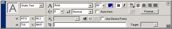
4. Creating your text - Use the Test Tool to create your text. Make sure that everything including the typeface, color, style and spacing are exactly the way you would like it to appear in the finished project. For this example, I used the domain name “faxswitch.com” for my text, Arial as the font, 60 as the font size, clicked bold. Since I used the align tool to align my image, x = 66.3 and y equals 164.5 and my width is 417.6 and my height is 71.0. If you use a different word or phrase your will differ from this.
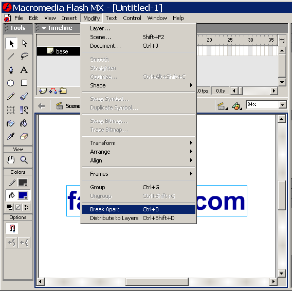
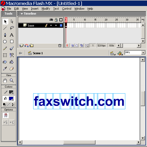
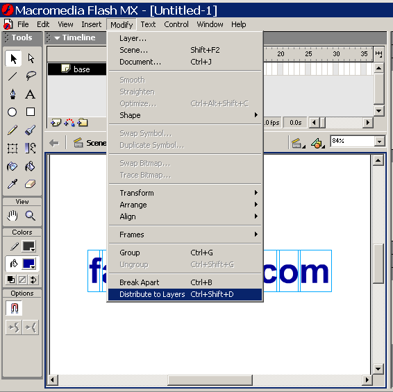
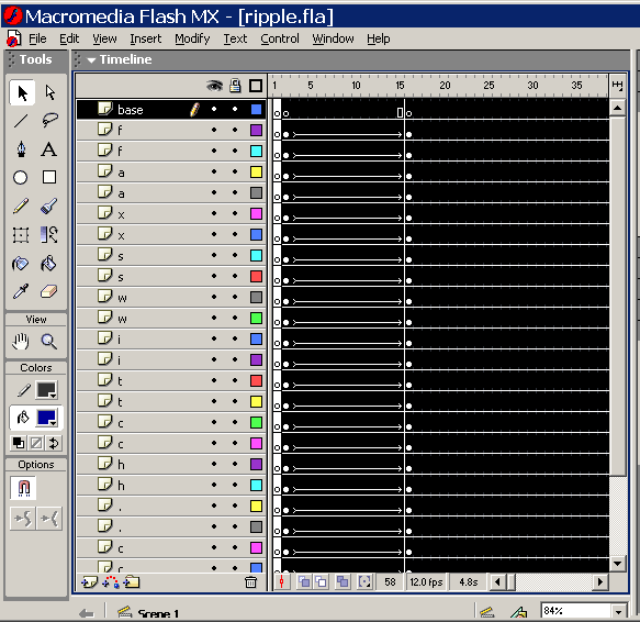
6. Distribute to Layers - Next you want to distribute your text to layers so you can tween the individual letters separately. Do this by Modify > Distribute to layers or alternatively by using the shortcut Ctrl+Shift+D
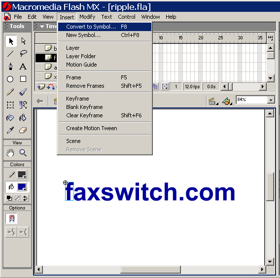
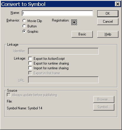
8. Convert each letter to a symbol - Click on the first letter then Insert > Convert to Symbol or alternatively click F8.
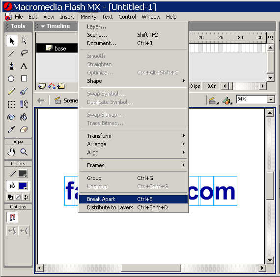
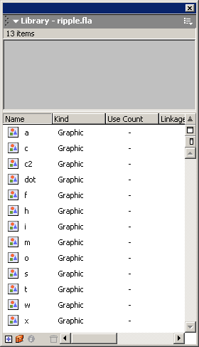
Repeat this procedure until all of your letters are turned into graphic symbols. Note, on my example I have two letters “c” in my phrase “faxswitch.com.” I named the first letter “c” symbol “c” and the second “c2”. Also I named my period as “dot”. Normally, in a real life project, I would likely make an “instance” or copy of my original letter “c” symbol, place it directly over the second “c”, and then remove the original in order to optimize the animation for lower file size. Since there is only one duplicate letter, and this is not a lesson in optimization, I will not do this for this exercise but I did want you to be aware of how this should be done if this were a commercial project. Also not that when you choose the letter “i”, you will need to hold down the control key and also select the dot before turning it into a graphic symbol. If you look at your symbols in your library (open by window > library or alternatively pressing F11). You should see each of your letter symbols in the library if you have done everything correctly up to this point.
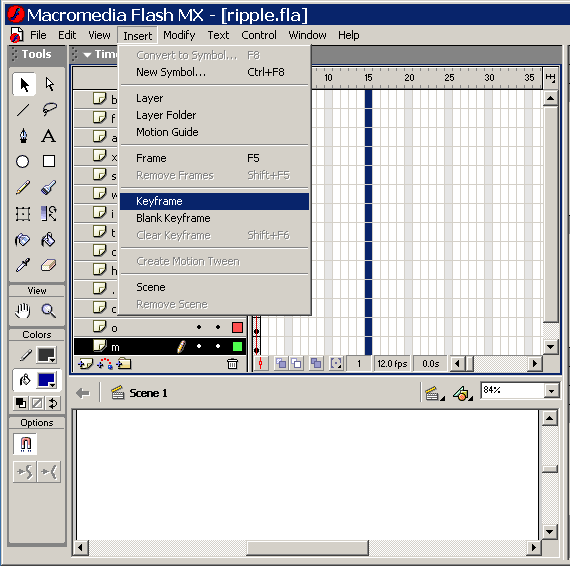
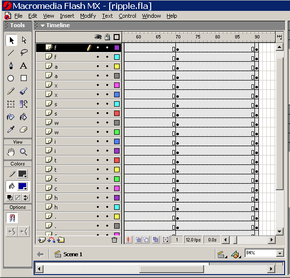
9. Inserting Keyframes - Click on frame 15 of the first layer (f in this case) while holding down the shift key and drag down through all of the letters. Then insert your keyframes by Insert > Keyframe.
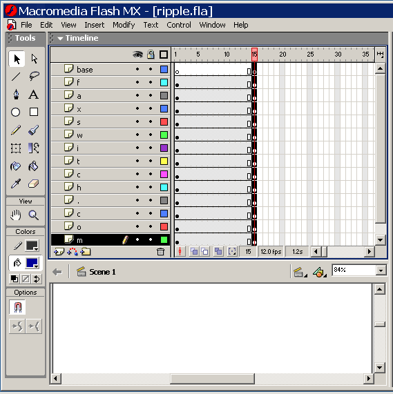
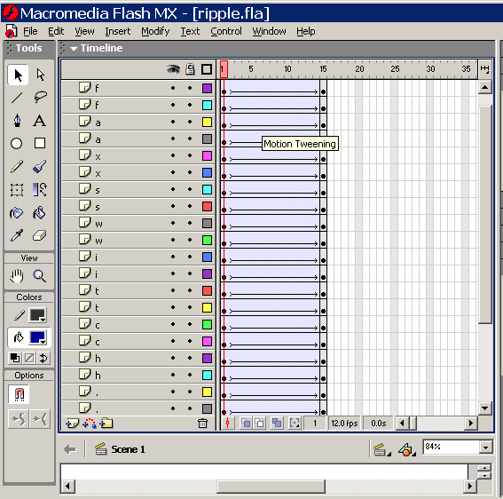
Now your Time line should look like this:
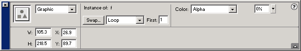
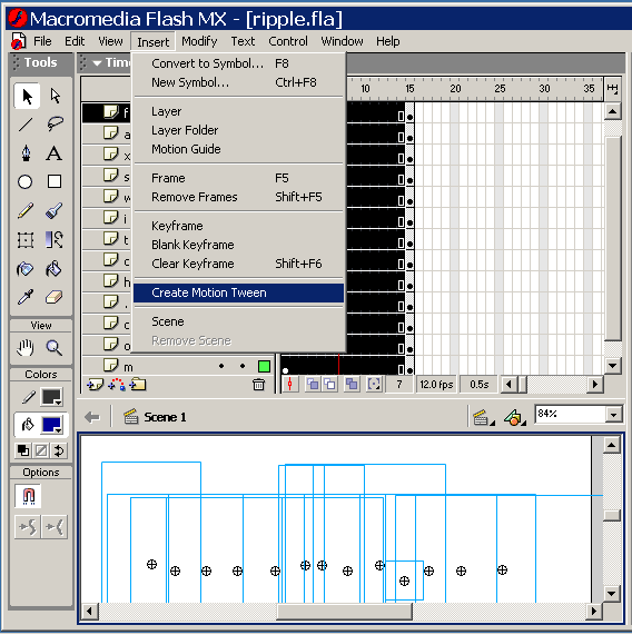
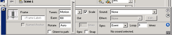
14. Adding the Effect - Click on the first frame of your first letter (letter “f”) again to select it. In the property inspector, change the color from “none” to “alpha” and reduce the alpha level from 100% to 0 %.
Note: If you are having trouble selecting your graphic be sure to select it in the window because if you select the letter in the frame, the frame properties will be shown instead fo the graphic's properties.
0r
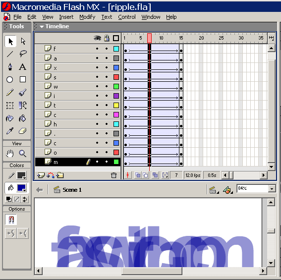
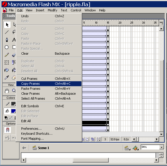
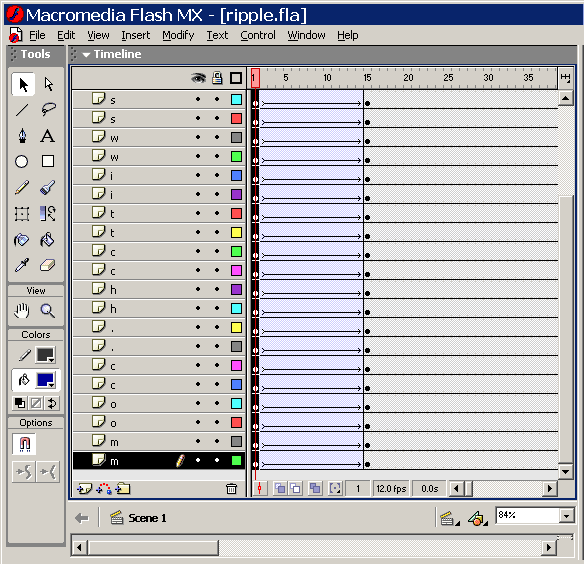
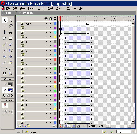
16. Creating the blurring effect - Add a new layer above each of the layers and then edit> copy frames and then edit > paste frames until there are two of each layer one above the other. Example: ffaaxxsswwiittcchh..ccoomm.
When you have created new frames, copied and pasted frames, your time line should look similar to this:
Select each of the first layer for the first letter (the letter “f” in this case) and transform it to 140%. Repeat this for the letters in the first frame of each letter group working your way down from top to bottom skipping a layer each time.
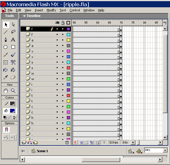
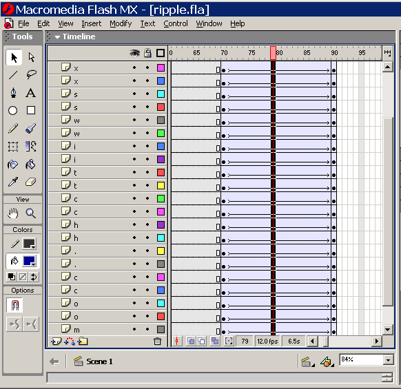
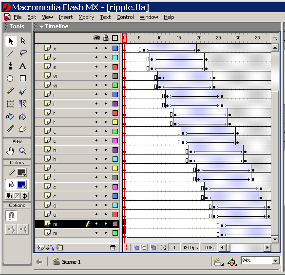
Copy and paste frame 1 fr0m all layers and paste it into frames 70.
Click to Download Zipped Finished FLA
|
|
______________________________ Last updated: 8/26/03 Webmaster: Paul Young |